

Mountain Home Colour Schemes: 7 Palettes That Work with Natural Wood
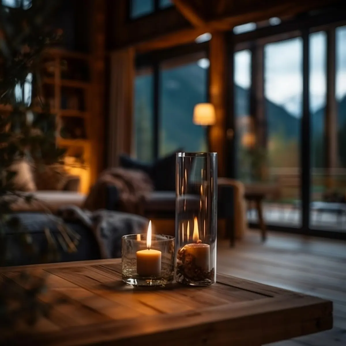
Mountain homes ask something particular of colour. The light shifts fast, snow bounces brightness through the windows, and rooms that sit quiet through the winter can feel cold even with the stove lit. Add a lot of pine, oak or reclaimed timber and the palette has to work with the wood rather than against it. Get it right and the timber looks richer than it did before you started.
Start With the Wood, Not the Paint
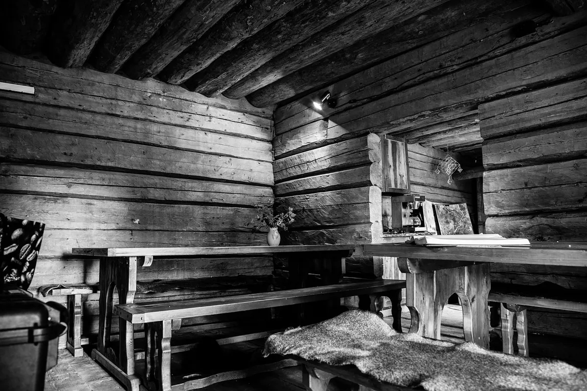
Before you open a single colour card, spend ten minutes looking at your timber. Pine tends to run yellow-orange, especially older boards under orange varnish. Oak sits in honey and olive territory, often with a green-grey undertone. Reclaimed timber is mixed by nature: red-brown beams, silvered boards, patches of old paint, nail-stained edges.
The common mistake is choosing a paint colour in isolation, then discovering the wood turns brash beside it. A cool blue-grey wall next to yellow pine will push the pine towards orange and make the paint look slightly grey and tired. A warm clay beside the same pine will calm it. Three things are worth noting before you choose anything:
- Undertone: does the timber lean warm (orange, red, gold) or cool (green, grey, silvery)?
- Light: north-facing rooms need warmth in the walls; south-facing rooms can carry cooler, deeper tones without going gloomy.
- Finish: wax, oil, soap, limewash and varnish all change how the timber reads under the same paint.
The Seven Palettes
1. Chalk, Clay and Warm Grey
The safest pairing for oak. Walls in a soft chalk white or warm clay grey, floors left as they are, and one deeper tone on the cabinetry or a single wall. Keep the greys warm — if the swatch looks faintly pink or biscuit rather than blue, you are close. Add oatmeal linen and unglazed stoneware for texture.
2. Sage, Olive and Stone
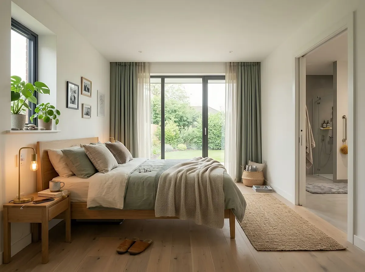
Green works beautifully with pine because it shares that earthy, slightly yellow base. Muted sage on the walls, a deeper olive on a dresser, pale stone textiles. Avoid bright emerald — it fights the timber. This palette suits bedrooms and quiet hallways where you want calm rather than drama.
3. Charcoal, Slate and Warm Black
Deep tones make honeyed pine glow. Use them sparingly: a chimney breast, kitchen island or window seat rather than every wall, or the room will shrink. Balance with plenty of off-white and natural daylight. In a dark mountain room, keep the black-brown rather than blue-black so it stays cosy.
4. Terracotta, Ochre and Rust
Made for reclaimed timber. The red-browns in old beams already carry these tones, so the paint simply echoes them. Try a muted terracotta on a hallway wall, ochre cushions, and a rust wool throw. Skip anything too saturated — you want earth, not pumpkin.
5. Deep Forest Green, Cream and Aged Brass
A classic for oak floors and traditional panelling. Green reads as grounded and slightly formal, and cream stops it turning heavy. Brass or bronze hardware picks up the warmth of the timber. Excellent for studies, dining rooms and entrance halls that need presence without glare.
6. Pale Fjord Blue, Driftwood and Off-White
The corrective palette for orange pine in small, north-facing rooms. A soft grey-blue wall, driftwood grey textiles and warm off-white woodwork. The coolness of the blue is offset by the warmth of the boards. Choose a blue with a grey base, not a clear pastel.
7. Mushroom, Taupe and Bitter Chocolate
Quiet, sophisticated and forgiving, particularly with darker stained timber or reclaimed boards with grey patina. Mushroom on the walls, taupe upholstery, bitter chocolate on trim or a low shelf. It looks expensive in a way that beige rarely manages, because there is real depth in it.
How to Stop a Scheme Going Flat
Two or three colours plus your timber is usually enough. Aim for roughly sixty per cent of the room in the dominant neutral, thirty in the secondary tone, ten in the accent — then repeat each colour at least twice so the eye finds it again. Vary the finish as well as the shade: matt emulsion on walls, eggshell on woodwork, and a mix of wool, linen, ceramic and brushed metal. Keep ceilings a shade or two lighter than the walls but still warm, otherwise the room reads top-heavy.
A Worked Example
Take a small, north-facing sitting room with reclaimed floorboards and a pale pine ceiling. Walls in a warm clay grey, ceiling in the same colour mixed a touch lighter, and the floorboards left bare with a soap finish. Add a terracotta lamp base, sage curtains in heavyweight linen, one charcoal armchair. Nothing matches exactly, but every tone sits in the same family, and the boards look warmer than they did when the room was magnolia.
Before You Buy Paint
- Order proper samples, not just paper swatches — paper lies about how a colour will look in volume.
- Paint two coats onto A4 or A3 card, leaving a white border, and tape it to the wall.
- Hold your offcut of timber next to the card. If the wood looks better, the colour works.
- Look at it at breakfast and again at dusk before deciding.
- Test the trim colour too, and check it against the wall in daylight.
- Note the tin details on your phone so future touch-ups match.
Living With It
Give samples a week. Colour shifts as the seasons change, and a palette that feels bold in June often feels exactly right by November. If you are unsure between two options, choose the warmer one — mountain light is cooler than most of us expect, and timber always rewards warmth around it. Once you have chosen, buy a little extra and keep it labelled. Reclaimed timber and natural finishes will shift over the years, and having the original colour on hand makes touching up simple rather than stressful.
Photo: HomeoGrapher / Pixabay